People and work.
Photography is where the brand becomes real: faces, hands, and sites. Every image belongs to one of two categories. Company shows the people and culture behind Alix; services shows the work itself. Both share one documentary, unstaged voice and the same sharp frames.
- Categories
- Company · Services
- Voice
- Documentary · unstaged
- Frame
- Sharp · crop to fill
- Ratios
- Named aspect ratios
Two categories
Sort every photograph before anything else. Company imagery covers people, culture, and the office; it makes the organisation human. Services imagery covers construction, robotics, operations, and hospitality; it shows what Alix actually does. Keeping the categories distinct stops a page from blurring into generic stock.

Company
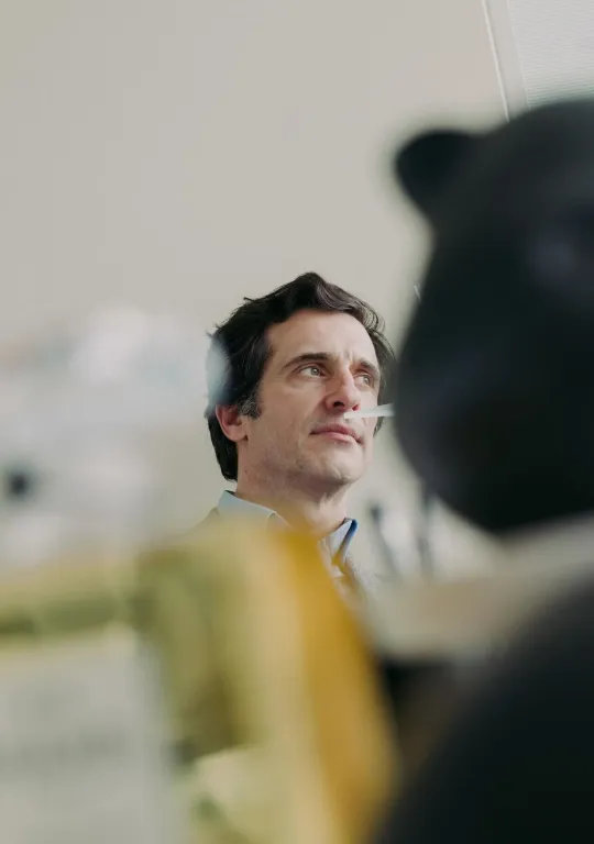
Employees · culture · officeThe people behind the work. Candid, warm, and human. Never a posed headshot wall.

Services
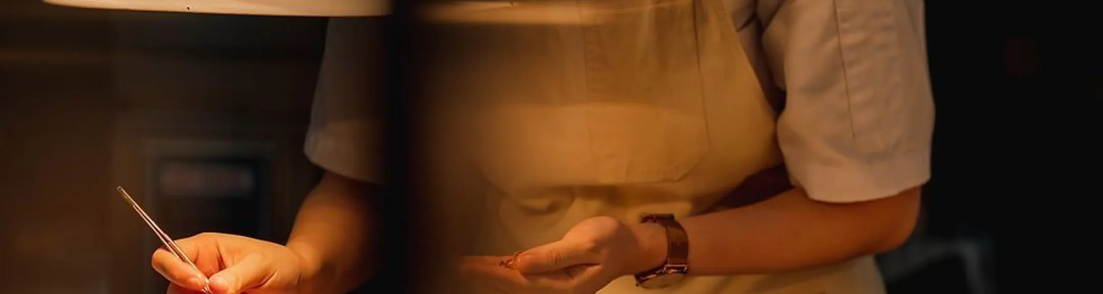
Construction · robotics · operationsThe work itself, on location. Real sites, real tools, real conditions.
The photographic voice
Both categories share one voice, and it keeps a mixed gallery coherent: documentary, not advertising. Shoot real people and real work in natural light; favour the candid moment over the staged setup; keep colour honest rather than heavily graded. The test is simple. It should look reported, not rented.


Named aspect ratios
Use named frames so media fills the frame without distortion and the subject stays intact. The named ratios are shared across standards, and if a medium needs an exception, define it in that application specification. The same photograph, held to several frames:

Framing
Images obey the same shape language as the rest of the system: hard, radius-0 corners. Never round them to soften the composition. Crop to fill without squashing the subject. The one expressive move is the brand's diagonal clip, used sparingly on hero media to echo the architectural lines elsewhere.
Pairing with type
Type goes over photography only with a scrim. Anchor a navy-to-transparent gradient behind the text to protect contrast as the image changes, then test the final pairing. Set headlines in Alix Sans 400; the photograph carries the colour while the type stays white and quiet.
Company
The people behind the work.
No scrim. Text fights the image.
Misuse
Imagery breaks the brand when it looks bought rather than made, or when it is framed unlike everything else in the system.