Elements
Content card
View in FigmaTeaser card for a piece of content, with media, tagline, title, and excerpt.
Install
npx shadcn@latest add @alix/contentCardPreview

Building the Alix Axis design system
A look at how sharp-cornered tokens and composable primitives come together across the system.
Usage
<ContentCard
  variant="news"
  alignment="vertical"
  media={{ type: "image", src: "/media/grey-arc.svg", alt: "" }}
  tagline="News"
  title="Building the Alix Axis design system"
  excerpt="A look at how sharp-cornered tokens and composable primitives come together across the system."
  href="/news/building-alix-axis"
/>
Examples
Horizontal news row
Use the horizontal alignment when the card needs to scan as a list row instead of a tile.

What liquidity teams need from a 13-week forecast
A practical view of the cadence, ownership, and decision points that make a forecast usable.
<div className="w-full max-w-2xl">
  <ContentCard
    variant="news"
    alignment="horizontal"
    leftBorder
    media={{
      type: "image",
      src: "/brand/editorial-1.jpg",
      alt: "Consultants reviewing project notes at a table",
    }}
    title="What liquidity teams need from a 13-week forecast"
    excerpt="A practical view of the cadence, ownership, and decision points that make a forecast usable."
    href="/insights/liquidity-forecast"
  />
</div>Editorial feature
Switch to editorial when the title and excerpt should carry more weight than the content category.
Port disruption is now a working-capital issue
Leaders are connecting freight reliability, inventory exposure, and near-term cash decisions into one operating rhythm.
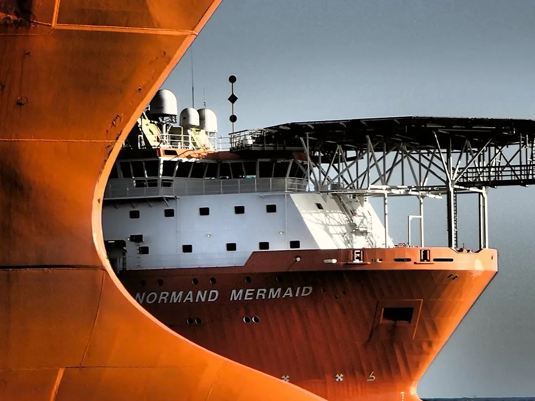
<div className="w-full max-w-xl">
  <ContentCard
    variant="editorial"
    alignment="vertical"
    leftBorder
    media={{
      type: "image",
      src: "/brand/ship.webp",
      alt: "Container ship underway",
    }}
    title="Port disruption is now a working-capital issue"
    excerpt="Leaders are connecting freight reliability, inventory exposure, and near-term cash decisions into one operating rhythm."
    href="/insights/port-disruption-working-capital"
    titleAs="h2"
  />
</div>Post row recipe
Let PostRowBlock own the equal-width row when a CMS delivers several ContentCard records together.
Board reporting under pressure
How finance teams keep decisions moving when the operating picture changes weekly.

Diligence findings that translate to value
A sharper handoff from transaction diligence into the first hundred days.

Capital projects need clearer control points
Where owners can reduce schedule risk before cost pressure compounds.
<div className="w-full max-w-5xl">
  <PostRowBlock
    columns={3}
    contentCards={[
      {
        media: {
          type: "image",
          src: "/brand/editorial-1.jpg",
          alt: "Consultants reviewing project notes at a table",
        },
        alignment: "vertical",
        title: "Board reporting under pressure",
        excerpt:
          "How finance teams keep decisions moving when the operating picture changes weekly.",
        href: "/insights/board-reporting",
      },
      {
        media: {
          type: "image",
          src: "/brand/editorial-2.jpg",
          alt: "Printed materials arranged for a project review",
        },
        alignment: "vertical",
        title: "Diligence findings that translate to value",
        excerpt:
          "A sharper handoff from transaction diligence into the first hundred days.",
        href: "/insights/diligence-to-value",
      },
      {
        media: {
          type: "image",
          src: "/brand/construction.webp",
          alt: "Construction site with cranes",
        },
        alignment: "vertical",
        title: "Capital projects need clearer control points",
        excerpt:
          "Where owners can reduce schedule risk before cost pressure compounds.",
        href: "/insights/capital-project-controls",
      },
    ]}
  />
</div>
When to use it
Use it for
- News, insight, or editorial teasers where the title is the link and the media supports scanning.
- Horizontal cards inside lists where rows need to compare quickly.
- Editorial cards when the title and excerpt should read as the lead content, not a category-led item.
Reach for something else
- Rows or grids of CMS-fed posts. Use PostRowBlock or PostGrid instead.
- People profiles with contact actions. Use EmployeeCard instead.
- Standalone metrics or KPI summaries. Use StatCard instead.
- Media-only galleries. Use MediaCarousel instead.
Props
| Prop | Type | Default | Description |
|---|---|---|---|
| variant | "news" | "editorial" | "news" | Editorial drops the tagline, uses a larger title, and lets the excerpt run full length; news clamps the excerpt to two lines. |
| alignment | "vertical" | "horizontal" | – | Required. Vertical stacks media above the body; horizontal places media beside it. |
| media | MediaContent | – | Image or video framed by the card, discriminated by type (defaults to image). |
| tagline | string | – | Eyebrow label above the title. Only shown on the news variant. |
| title | string | – | Heading text. Becomes the card's link when href is set, so its accessible name stays just the title. |
| excerpt | string | – | Short summary below the title. |
| href | string | – | Destination for the card. When set, a stretched link makes the whole card surface clickable; omit it for a static, non-interactive article. |
| openInNewTab | boolean | false | Only meaningful with href. Opens the link in a new tab with a visually-hidden hint. |
| leftBorder | boolean | false | Adds a left border on the card. |
| titleAs | "h2" | "h3" | "h4" | "h3" | Semantic heading level for the title; set it to fit the page outline. Visual size is fixed by the design. |